- Home
- Games
- Company
- Careers
- Community
- Roadmap
- Media
- Store Support
- Feedback
- Contact Us
0
0
- Warhammer 40K
- Home
- Community
- Hub
- Skill-Tree Design
Featured comment
Skill-Tree Design
Your Thoughts? Please login to place your opinion. Not a member yet? Register here and now!
Your Thoughts? Please login to place your opinion. Not a member yet? Register here and now!
1
swinweflue
12
28
12.06.2018
+0
0
I would also appreciate it if some skills are moved to "optional" sidepaths. I often have to get skill, which have no use to me, just to finally get the one i like.
For example in the "Melee" Tree, just make all the "Main" Paths to the center %dmg, crit or the like and put everything else on the sidepaths.
12.06.2018
+2
2
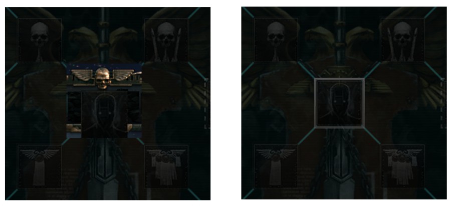
The Capstone skills could definitely use a slight graphical tweak.
Due to the design of many of trees, it can actually be difficult to tell where the capstone even is, and I do not remember seeing anything that specifically informs the user that they need to complete the entire tree in order to unlock the capstone.

Set this current order state as My default.